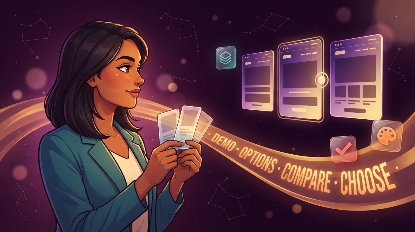
What is a demo page?
A demo page is a private comparison page Ullbek builds so you can see options — not just talk about them. It lives under _internal, so it works like a real page in the builder preview and is never published with your site.
You open it, scroll, click around, and compare designs side by side. When you know which direction you like, you tell the agent — and it applies the winner to the real page. That loop is one of the most useful ways to work with an AI website builder.
See three options. Pick one. Ship the winner.
Demos are a special kind of internal page. Same private folder, same “never goes live” rule — focused on comparing directions before you commit.
Why demos beat “just pick one”
Design conversations get fuzzy fast. “Something cleaner” or “a bit more bold” means different things to different people. A demo turns that into something you can point at.
Side by side, not sequential
Options A, B, and C on one page beat thrashing the live homepage three times in a row.
Live site stays stable
Explore freely without risking what visitors already see. Commit only when you’ve chosen.
Real brand, real content
Demos can use your actual CSS, fonts, and copy — so options look like the finished site, not wireframes.
Clear decisions
“I like Option B” is a better brief than “make it warmer.” The agent knows exactly what to apply.
Real use cases
Here’s where demos shine in day-to-day building — the same patterns people use constantly with Ullbek.
Navigation bar designs
Three or four header styles on one page — minimal top bar, centered logo, sticky with CTA, mega-menu tease. Pick the one that fits your brand and link count without guessing from descriptions.
Hero treatments
Same page, different openings: full-bleed photo vs split layout, short headline vs story lead, single CTA vs dual. You’ll feel which one lands before anything goes public.
How to present information
Services as cards, a comparison table, a timeline, or an accordion — same facts, different structure. Ideal when you know the content but not the shape.
Color combinations
Three palettes applied to the same hero and card so you can compare warmth, contrast, and personality without re-theming the whole site each time.
Font pairings
Heading + body combos on real sample copy. Serif editorial vs clean sans vs mono accents — see hierarchy and readability before you lock the brand kit.
Section layouts
Pricing, services, team, or testimonials in alternate structures — grid, list, featured row, alternating blocks. Useful mid-build when a section “isn’t quite right.”
Mobile-first checks
Stack the same options for a phone-width feel, or ask for a demo that emphasizes how each option collapses. Catch crowded navs and oversized type before you ship.
“Before you rewrite” drafts
Two tone versions of an About page or homepage lead — warmer vs more direct, short vs story-led — so you choose voice with eyes, not only with instincts.
The best demos keep content constant and change only the presentation. Same services, three layouts. Same logo, three navs. That’s how you actually choose.
How a demo session usually goes
-
You ask for options
Say what you’re exploring and roughly how many directions (three is a great default). Add constraints if you have them — “must fit a logo + five links,” “keep our brand colors.”
-
Ullbek builds a private demo
It lands under
_internal, often with clear Option A / B / C labels, and opens in the preview so you can browse it immediately. -
You pick a winner (or a mix)
Scroll, compare, and decide. Prefer the nav from A and the hero from C? Say so — demos are for choosing pieces as well as whole packages.
-
Apply it to the real site
“Apply Option B to the live homepage” is enough. The agent ports the chosen design onto the public page and leaves the demo for reference if you want it.
-
Keep or clean up
Demos are saved with the project. Keep useful ones for later, or ask Ullbek to remove ones you’re done with.
Sample prompts you can paste
You don’t need special syntax. Saying “demo page” or “show me options” is enough — these examples are ready to copy and tweak.
Tips for better demos
- Say how many options — three is the sweet spot; two can feel binary, five can overwhelm.
- Name constraints — logo width, number of nav links, must use existing brand colors, mobile-first, etc.
- Ask for labels — “Option A / B / C” plus a one-line pro for each makes choosing faster.
- Keep content constant — change presentation, not the underlying facts, when you’re testing layout.
- Decide in the demo — don’t ask the agent to rebuild the live page until you’ve chosen a direction.
- Mix freely — “nav from A, hero from C, colors from B” is a perfectly good decision.
Demo pages vs. other internal pages
Everything below lives under _internal and never publishes. The difference is purpose:
Demos, the Site Brief, and notes all sit under _internal. See Internal pages for the full private-area story.
Common questions
Do demo pages go live?
No. They live under _internal and are excluded every time you publish — free subdomain or custom domain. Visitors never see them.
Can I keep several demos?
Yes. Keep as many as are useful. Ask Ullbek to list what’s under internal, open a specific demo, or delete ones you’re done with.
Can I share a demo URL with a client?
Not via the published site — demos have no public address after publish. Review together in the builder, share screenshots, or promote the chosen design to a public page when you’re ready.
What if I like pieces of two options?
Say exactly that: “Use the nav from A and the hero from C.” The agent can merge pieces onto the real page without forcing an all-or-nothing choice.
Should every decision use a demo?
No. Use demos when directions are meaningfully different — nav styles, layout systems, color systems, presentation of the same content. Small tweaks (“make the button slightly larger”) don’t need a full comparison page.
Do demos use my real brand?
They can and usually should. Ask for options “using our real CSS and content” so you’re comparing finished-looking designs, not abstract wireframes.
Try a demo on your next stuck moment
Next time you’re between two designs — or three — ask for a private demo page instead of rebuilding the live one until it feels right.